TYPOGRAPHY:
This is an example "Header 1" (H1)
This is an example "Header 2" (H2)
This is an example "Header 3" (H3)
This is an example "Header 4" (H4)
This is an example "Header 5" (H5)
This is an example "Header 6" (H6)
Display 1
Display 2
Display 3
Display 4
This is an example paragraph. This Kitchen Sink page displays most of what's possible using only the WYSIWYG (What You See Is What You Get) content editors in WordPress on this site.
This is another example paragraph with some additional elements. This is bold text elit, sed do eiusmod tempor incididunt ut inline link labore et dolore magna aliqua. Ut enim ad minim veniam, strikethrough text laboris nisi ut aliquip ex ea commodo consequat. Underlined text reprehenderit in marked text velit esse cillum dolore eu fugiat nulla pariatur. Excepteur sint occaecat <inline code> non proident, sunt in culpa qui officia this is abbr text mollit anim id est laborum. ctrl + , (keyboard instructional text).
Example unordered list:
- Item 1
- Item 2 (a longer item here) lorem ipsum dolor sit amet, consectetur adipisicing elit, sed do eiusmod tempor incididunt
- Item 3
- Nested Item 1
- Nested Item 2
- Item 4 donec id elit non mi porta gravida at eget metus. Donec sed odio dui.
- Item 5 etiam porta sem malesuada magna mollis euismod. Aenean eu leo quam. Pellentesque ornare sem lacinia quam venenatis vestibulum.
Example ordered list:
- Item 1
- Item 2 (a longer item here) lorem ipsum dolor sit amet, consectetur adipisicing elit, sed do eiusmod tempor incididunt
- Item 3
- Nested Item 1
- Nested Item 2
- Item 4 donec id elit non mi porta gravida at eget metus. Donec sed odio dui.
- Item 5 etiam porta sem malesuada magna mollis euismod. Aenean eu leo quam. Pellentesque ornare sem lacinia quam venenatis vestibulum.
Example definition list:
- Definition Term
- Definition description.
- Definition Term 2
- Definition description 2.
- Definition Term 3
- Definition description 3.
Example blockquote:
Lorem ipsum dolor sit amet, consectetur adipiscing elit. Integer posuere erat a ante.
Example <hr> (horizontal rule):
MEGA MENU:
- First make sure CSS Class is checked in the Screen Options (upper right)
- Place Top Level nav items first
- If you want a Heading in the sub menu add in a Custom Link with "#" as the URL and whatever text you want as the Text.
- The CSS Class for the heading should be set to "heading".
- A column size should also be set for the heading. e.g.
col,col-6,col-4etc.- The columns are based on a 12 column grid so
col-6would create a menu with two columns, andcol-4would be three columns, etc. colwill automatically fill the remaining space, so if you want all evenly-sized columns that fill the width of the window, you can give each a class ofcol.col-autowill contract the width to the content size. To center the columns within the window, give eachcol-auto.- You can also give the parent item
simple-menuto make the layout a simple vertical list
- The columns are based on a 12 column grid so
AVAILABLE SHORTCODES:
The following custom shortcodes can be copied and pasted into any WYSIWYG editor on the site to output dynamic content. The red examples below show default values; in other words, if you omit certain attributes when using the shortcode, the default values will be applied.
[btn][gravityform][columns-two][columns-three][columns-four][collapse][icon][leon-provider-listing]
Buttons
[btn text="Contact Us" url="/contact-us/" color="primary" size="" ghost="false" block="false" xclass=""]
- Change
textto whatever text you want displayed on the button (defaults to "Contact Us" if not defined). - Change
urlto wherever you want the button to link to (defaults to "/contact-us/" if not defined) colorcan beprimary(default, blue),blue,secondary(red),red,whiteordark(dark gray).sizecan besmall, empty (default, which is medium-sized), orlarge.ghostcan betrueorfalse(default), which generates an outlined button instead of a solid background.blockcan betrueorfalse(default), which generates a full-width block button.xclass- include any additional CSS classes you wish to add here.
Small Regular (no size defined) Large
Primary Color (no color defined) Secondary Color White Dark
Primary Ghost Secondary Ghost White Ghost Dark Ghost
Forms
[gravityform id="1" title="false" description="false" ajax="true"]
- Change
idto the ID of the desired form. Form IDs are: Contact Us (EN) - 1, Contact Us (ES) - 2, Request Printed Materials (EN) - 3, Request Printed Materials (ES) - 4 - Change
titletotrueto show thw form's title. Should usually be left asfalse. - Change
descriptiontotrueto show the form's decsription. Should usually be left asfalse. ajaxshould always be set totrue.
Columns
Split content in content editors into two, three or four equal-width columns. Vertically align content to the top (default), middle or bottom of the columns. Optionally condense the width of the overall container by setting condensed to true. Optionally include additional CSS classes via xclass.
[columns-two valign="top" xclass="" condensed="false"] ...your content here... [column-split] ...your content here... [/columns-two]
- or -
[columns-three valign="top" xclass="" condensed="false"] ...your content here... [column-split] ...your content here... [column-split] ...your content here... [/columns-three]
- or -
[columns-four valign="top" xclass="" condensed="false"] ...your content here... [column-split] ...your content here... [column-split] ...your content here... [column-split] ...your content here... [/columns-four]
Expandable/Collapsible Content
[collapse button_text="View More" button_class="btn-primary" xclass=""] ... [/collapse]
(replace the ellipsis above with the content you wish to expand/collapse)
button_text- define the button text (defaults to "View More").button_class- define button styling using Bootstrap 4 button classes (btnis already added).xclass- add extra CSS classes to the element's outer wrapper (separate multiple by spaces).
…put your content here…
Icon Library & Shortcode
[icon icon="leon" url="" size="lg" xclass=""]
- Do NOT use the XML in WYSIWYG editors; use the shortcode instead.
- Optionally add
url="https://www.google.com/"to the shortcode to turn the icon into a link (changing the URL). - Optionally change
sizetoxs,sm,mdorxl(lgis default):
xssmmdlgxl - You can change an icon's color by adding these CSS classes as an
xclassparameter on the shortcode:blue (primary)red (secondary)aquawhiteblack(default)
- (The leon logo and mark cannot change colors.)
- For example, "
[icon icon="atom" url="https://ruffalonl.com/" xclass="blue"]" will display the following (notice its color and that it's a link):
| Preview | Name | Shortcode | XML (requires loading of symbol.svg, which is loaded sitewide) |
|---|---|---|---|
| 24-711 | [icon icon="24-711"] |
<svg><use href="#24-711" xlink:href="#24-711"></use></svg> |
|
| atom | [icon icon="atom"] |
<svg><use href="#atom" xlink:href="#atom"></use></svg> |
|
| chevron-down | [icon icon="chevron-down"] |
<svg><use href="#chevron-down" xlink:href="#chevron-down"></use></svg> |
|
| chevron-left | [icon icon="chevron-left"] |
<svg><use href="#chevron-left" xlink:href="#chevron-left"></use></svg> |
|
| chevron-right | [icon icon="chevron-right"] |
<svg><use href="#chevron-right" xlink:href="#chevron-right"></use></svg> |
|
| chevron-up | [icon icon="chevron-up"] |
<svg><use href="#chevron-up" xlink:href="#chevron-up"></use></svg> |
|
| close | [icon icon="close"] |
<svg><use href="#close" xlink:href="#close"></use></svg> |
|
| directions | [icon icon="directions"] |
<svg><use href="#directions" xlink:href="#directions"></use></svg> |
|
| doctor | [icon icon="doctor"] |
<svg><use href="#doctor" xlink:href="#doctor"></use></svg> |
|
| doctor-f | [icon icon="doctor-f"] |
<svg><use href="#doctor-f" xlink:href="#doctor-f"></use></svg> |
|
| doctor11 | [icon icon="doctor11"] |
<svg><use href="#doctor11" xlink:href="#doctor11"></use></svg> |
|
| electronic-clinic11 | [icon icon="electronic-clinic11"] |
<svg><use href="#electronic-clinic11" xlink:href="#electronic-clinic11"></use></svg> |
|
[icon icon="email"] |
<svg><use href="#email" xlink:href="#email"></use></svg> |
||
[icon icon="facebook"] |
<svg><use href="#facebook" xlink:href="#facebook"></use></svg> |
||
| feminine-health11 | [icon icon="feminine-health11"] |
<svg><use href="#feminine-health11" xlink:href="#feminine-health11"></use></svg> |
|
| home | [icon icon="home"] |
<svg><use href="#home" xlink:href="#home"></use></svg> |
|
| hospital | [icon icon="hospital"] |
<svg><use href="#hospital" xlink:href="#hospital"></use></svg> |
|
| info | [icon icon="info"] |
<svg><use href="#info" xlink:href="#info"></use></svg> |
|
[icon icon="instagram"] |
<svg><use href="#instagram" xlink:href="#instagram"></use></svg> |
||
| labs | [icon icon="labs"] |
<svg><use href="#labs" xlink:href="#labs"></use></svg> |
|
| leon-employee | [icon icon="leon-employee"] |
<svg><use href="#leon-employee" xlink:href="#leon-employee"></use></svg> |
|
| leon-logo-horizontal | [icon icon="leon-logo-horizontal"] |
<svg><use href="#leon-logo-horizontal" xlink:href="#leon-logo-horizontal"></use></svg> |
|
| map-marker | [icon icon="map-marker"] |
<svg><use href="#map-marker" xlink:href="#map-marker"></use></svg> |
|
| med_bag | [icon icon="med_bag"] |
<svg><use href="#med_bag" xlink:href="#med_bag"></use></svg> |
|
| minus | [icon icon="minus"] |
<svg><use href="#minus" xlink:href="#minus"></use></svg> |
|
| minus-circle | [icon icon="minus-circle"] |
<svg><use href="#minus-circle" xlink:href="#minus-circle"></use></svg> |
|
| minus-square | [icon icon="minus-square"] |
<svg><use href="#minus-square" xlink:href="#minus-square"></use></svg> |
|
| mri11 | [icon icon="mri11"] |
<svg><use href="#mri11" xlink:href="#mri11"></use></svg> |
|
| myleonchart16 | [icon icon="myleonchart16"] |
<svg><use href="#myleonchart16" xlink:href="#myleonchart16"></use></svg> |
|
| person | [icon icon="person"] |
<svg><use href="#person" xlink:href="#person"></use></svg> |
|
| pharmacy | [icon icon="pharmacy"] |
<svg><use href="#pharmacy" xlink:href="#pharmacy"></use></svg> |
|
| pharmacy11 | [icon icon="pharmacy11"] |
<svg><use href="#pharmacy11" xlink:href="#pharmacy11"></use></svg> |
|
| phone | [icon icon="phone"] |
<svg><use href="#phone" xlink:href="#phone"></use></svg> |
|
[icon icon="pinterest"] |
<svg><use href="#pinterest" xlink:href="#pinterest"></use></svg> |
||
| plus | [icon icon="plus"] |
<svg><use href="#plus" xlink:href="#plus"></use></svg> |
|
| plus-circle | [icon icon="plus-circle"] |
<svg><use href="#plus-circle" xlink:href="#plus-circle"></use></svg> |
|
| plus-square | [icon icon="plus-square"] |
<svg><use href="#plus-square" xlink:href="#plus-square"></use></svg> |
|
| search | [icon icon="search"] |
<svg><use href="#search" xlink:href="#search"></use></svg> |
|
| settings | [icon icon="settings"] |
<svg><use href="#settings" xlink:href="#settings"></use></svg> |
|
| specialty-care | [icon icon="specialty-care"] |
<svg><use href="#specialty-care" xlink:href="#specialty-care"></use></svg> |
|
| stethoscope | [icon icon="stethoscope"] |
<svg><use href="#stethoscope" xlink:href="#stethoscope"></use></svg> |
|
| telehealth | [icon icon="telehealth"] |
<svg><use href="#telehealth" xlink:href="#telehealth"></use></svg> |
|
| tooth | [icon icon="tooth"] |
<svg><use href="#tooth" xlink:href="#tooth"></use></svg> |
|
| transportation | [icon icon="transportation"] |
<svg><use href="#transportation" xlink:href="#transportation"></use></svg> |
|
| transportation11 | [icon icon="transportation11"] |
<svg><use href="#transportation11" xlink:href="#transportation11"></use></svg> |
|
[icon icon="twitter"] |
<svg><use href="#twitter" xlink:href="#twitter"></use></svg> |
||
| urgent-care | [icon icon="urgent-care"] |
<svg><use href="#urgent-care" xlink:href="#urgent-care"></use></svg> |
|
| urgent-care11 | [icon icon="urgent-care11"] |
<svg><use href="#urgent-care11" xlink:href="#urgent-care11"></use></svg> |
|
| user-circle | [icon icon="user-circle"] |
<svg><use href="#user-circle" xlink:href="#user-circle"></use></svg> |
|
| user-doctor | [icon icon="user-doctor"] |
<svg><use href="#user-doctor" xlink:href="#user-doctor"></use></svg> |
|
| wellness | [icon icon="wellness"] |
<svg><use href="#wellness" xlink:href="#wellness"></use></svg> |
|
| wellness11 | [icon icon="wellness11"] |
<svg><use href="#wellness11" xlink:href="#wellness11"></use></svg> |
|
| youtube | [icon icon="youtube"] |
<svg><use href="#youtube" xlink:href="#youtube"></use></svg> |
CONTENT BLOCKS:
With each of these blocks, you can change padding above and below.
Basic Content
This block is a basic content editor.
Basic 2 Columns
This block allows you to create two columns in a row. You have options to change the background as well.
Full-Width CTA
You can add any content you want in this block, and you have options for the background.
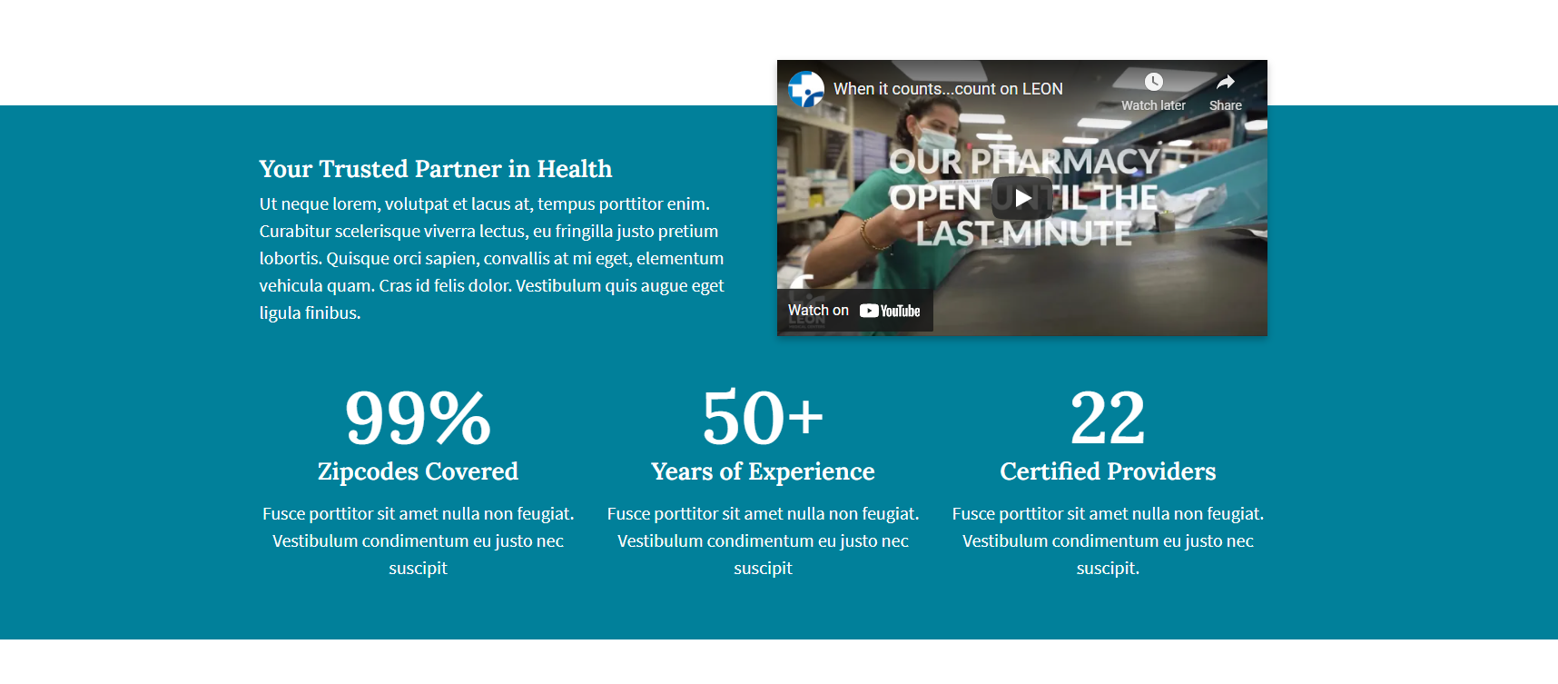
Statistics
Here you can enter up to 3 columns of statistics. The numbers will count up when the user scrolls to them. You have options for backgrounds and to add content above the statistics.
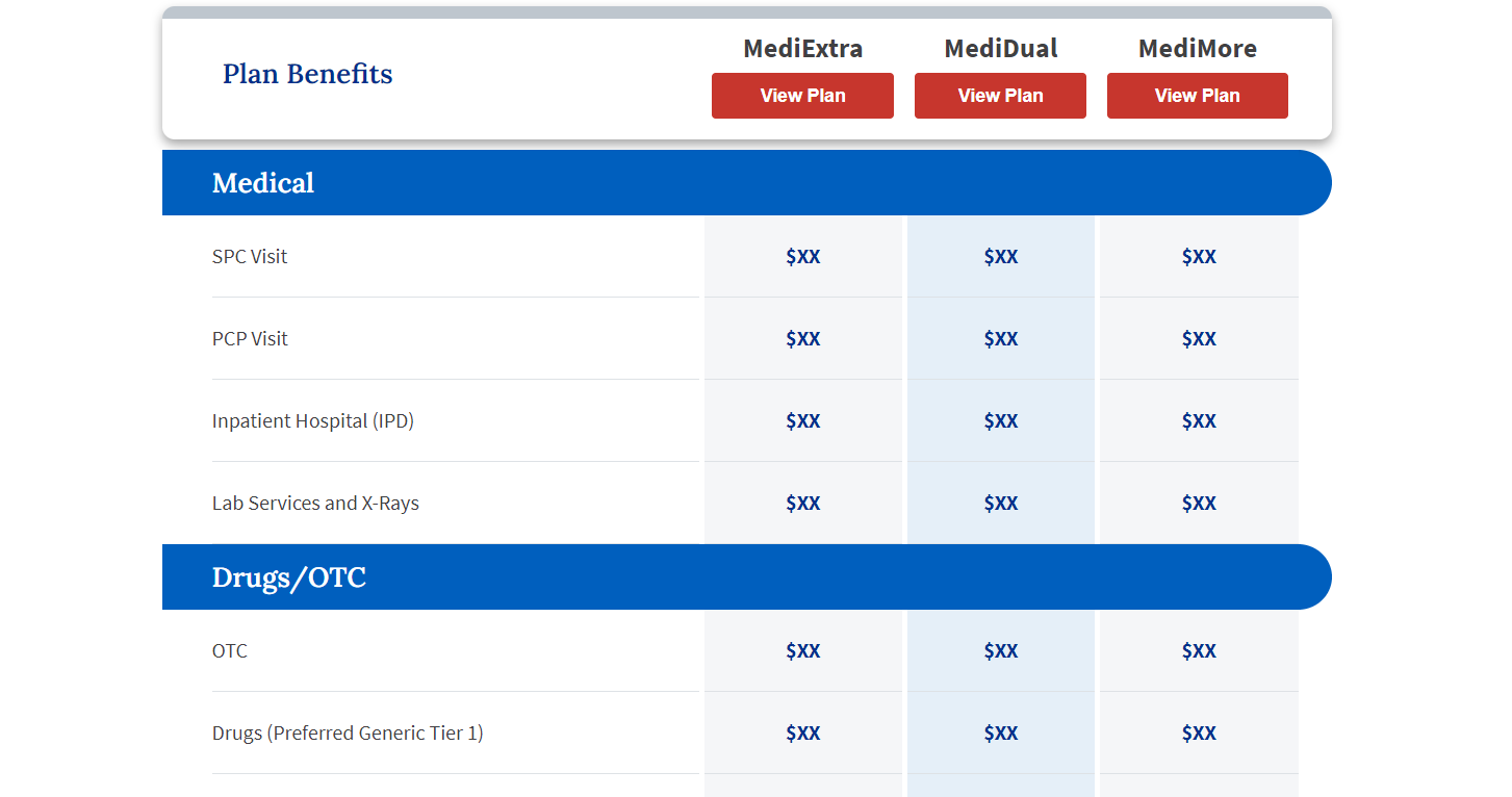
Table
This block allows you to adda a basic table. It's the block used for the price comparison table. The first column in the table will always be left aligned and the other columns will be centered.
You have the option to add a table header and make it sticky by toggling on the "Sticky Table Header" field.
To add a blue bar section header within the table, enter the header text in the first cell of the row you want to be the header. Add the text "---HEADER---" directly in front of the header text with no spaces.
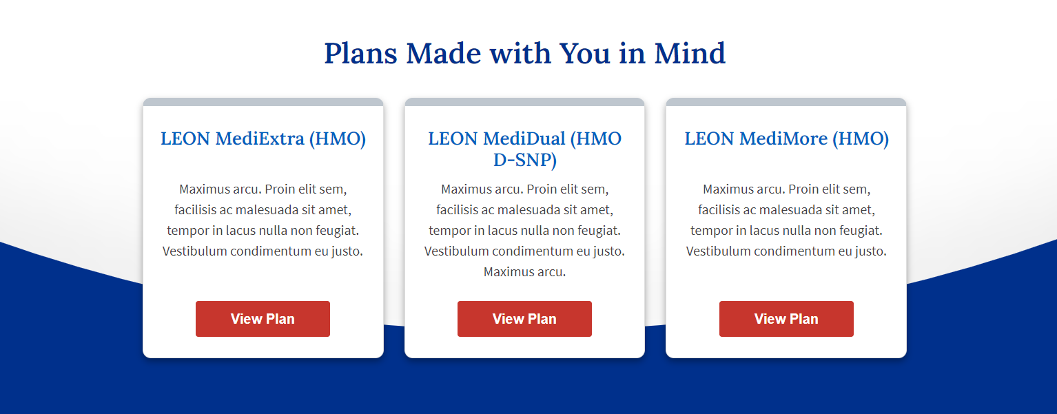
Cards
Here you can add as many cards as you'd like, with up to 4 cards in a row.
You have the option to:
- add no border,
- add a border around each card, or
- add a border around the whole section of cards.
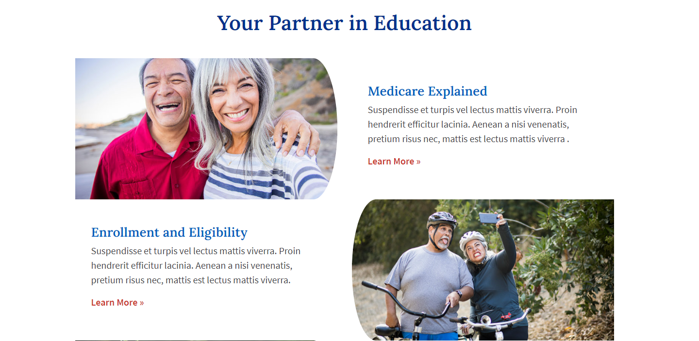
Curved Images Layout - 2 Columns
This block lets you add content in rows of 2-columns, where one column contains an image with a curved side and the other column can be any content you want.
The side the image is on should switch in each row to create an alternating pattern.
PAGE OPTIONS:
These options are present for every page on the side of the page's editor. They can all be "disabled", but they're "enabled" by default. The front page is the only page all options won't work on, as it isn't meant to have breadcrumbs and requires a banner.
The options are:
- Header: This controls visibility of the header (including utility nav & main nav).
- Navigation: This controls visibility of the main navigation.
- Banner: This controls whether or not the hero shows.
- Breadcrumbs: This controls whether or not the page will have breadcrumbs at the top.
- Left Sidebar: This controls whether the sidebar shows. If left enabled, you have some options to customize the sidebar.
- Blue Footer CTA: This controls the full width blue CTA that appears below the content.
- 2 Column Footer CTAs: This controls the 2-column CTAs with icons that appears below the blue CTA.
- Footer: This controls visibility of the footer (not including the CTAs).